Planning Blog 3: Title Design

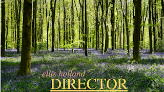
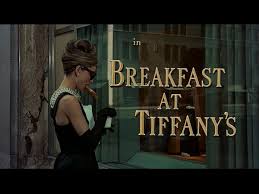
I will be using three fonts for my opening sequence. 1. A hand-drawn font for the title of the movie and main characters. 2. Capital Times New Roman (ex. DIRECTOR) for the roles of crew 3. Itallic all lowercase Times New Roman for names of crew and actors. (ex. julieta lencina) \ I choose these bright colors to contrast with the natural landscape of the setting. The name of the crew member is meant to be the focus of the title. With my hand-drawn title, I plan to make it very colorful and almost sticker-like in order to stand out. Titles will fade in and out of each scene, and stay on screen for about 5 seconds in order to keep the pace of the film. At this point, I plan to call my film "Park". I choose this name because it is short and will look nice in the stylization I have planned and because most of the film takes place in the natural park landscape.

